Introduction
This page shall depict research, preparation and construction of film posters in order to create our own film poster for our short film Life of Hermit.

It is imperative that as a group and individually we dedicate hard work and devotion to this task as it is worth 10 marks. We shall create our poster using the software Photoshop as we have experience with this software being as we briefly used it last year. As film posters are used for marketing campaigns, our poster must look professional in every aspect whilst also standing out. Being as the poster will advertise our film, it must include something about the plot without giving to much away.
As a group, we shall look for and analyse a number of film posters that have similar themes and plots to our film so that we have an idea of how we could create our poster. Once we have created our first print poster, we shall present it to our class so that we can listen to their feedback and make effective improvements which should hopefully give our final poster its highest potential mark.
Film Poster R&P

At first glance at the poster, our attention is attracted to the seemingly unhappy teenage boy sat at what looks like the bottom of a swimming pool. The setting of this picture hints that the water park will play a significant part in the films narrative, also as he is sat down there on his own depicts his character as being alone and isolated which he is in the film. Being as the image of the boy is larger than the images of the other characters indicates that he is the main character of this film. The actual water park is included just above the the teens head in the centre of the poster, this suggests that the water park will be a main setting in the film as the other characters are positioned either side of the park.
At the top of the poster is the statement 'A new comedy from the studio that brought you Little Miss Sunshine and Juno' this is included as it is indicating that if the audience liked either of these films then they are more than likely going to like this film because its made by the same studio. This film has the tagline 'We've All Been There' by integrating the audience in the tagline by the use of the word "We" suggests that whatever issues this teenage is facing everybody has faced them at some stage. Also, from the tagline the audience has a clue of what the film may be about as from using this specific statement along with how the poster looks with the boy sat on his own indicates that the film will be based on problems that teenager have when growing up. Such as insecurity, isolation and lack of self confidence.
This is the main poster for this film as it includes information about the production personnel, the cast and the distributor.
The main picture of the lad shows him sat down slouching with a with a reflective slightly fed up facial expression. As the boy is slouching depicts him to the audience as being unhappy and fed up. Additionally, in this case slouching connotes the boy feeling good for nothing. The expression on his face portrays to the audience that he unhappy and isolated.
Integrating the tag line of the movie with the boys facial expression and body posture, the audience assumes that the films narrative will revolve around teenage and puberty.


As mentioned above, this particular poster is the main poster for this film, as it includes the cast, production personnel and the distributors. However there are four different types of film poster which are: Teaser posters, Main posters, DVD release posters and Character posters. Each of these posters have different purposes which will be identified further down the page.
Example 2: Boyhood


Teaser Poster
A teaser poster is designed to attract the viewers attention to the film, to make them want to watch the film based on the teaser poster that they have seen. Usually they don't give to much away about the plot but they tend to include the stars in the film as advertisement for the film. All teaser posters will inform the viewer when the film will be released.

The image above is a teaser poster for the Iron Man trilogy Iron Man 3. Notice how all's that is included on the poster is a glimpse of what may feature in the film, the title and the release date. This includes all the conventional elements of a teaser poster.
Main PosterMain film posters include the following information; information about the production personnel, all the stars that are in the film and the distributors.

This is a typical main film poster, at the top of the image we see the actors names which is purely intended to persuade viewers to come and see the film based on who is in it. The image itself gives away the genre of the film as we can see flying robots in the background with Robert Downey Jr in the centre of the image with a serious and focused facial expression. This makes it evident to the viewer that the film will be in the action/adventure genre.

The image above includes information about the production crew and the distributors.
DVD Release Poster
DVD posters are released when the film is available to but on DVD. They tend to included all of the elements of a main film poster with one lines reviews from publications.

At the bottom of the image you may be able to see the statement "the best Iron Man yet" this is how we know that this particular poster is a DVD release poster. As a film critic has given their judgement on the film.
Software Training
 |
| Once I had selected everything I wanted to keep, I created a new layer, named it soldier and then deleted the original background. |
To ensure that all of our group is comfortable with using Photoshop, we are each individually going to do some practice using the software. So that when we begin to construct our poster, we are all familiar with how to use it.
 |
| First of all, I had to select my image and then draw around it using the Quick Selection tool. This is really easy to use as everything that you want to keep in the image you just draw around using this tool. If you accidentally select something that you don't want to keep, then you use the eraser tool to get rid of it. |
 |
| The next thing I had to do was begin to add a new background starting with the floor. Again for this I added a new layer and named it 'ground'. To add the black rectangle, I selected the rectangular marquee tool and drew a rectangle just above the soldiers knees down to the bottom of the page. |
 |
| To add the sky background in, I selected the 'sky' image out of the stock images folder and then opened it in photoshop. Initially the image opened as a new project, so once I had unlocked the background, using the move tool I dragged the image to the top left of the page where my soldier project was and dumped in that project. Which left the image as you can see above. |
 |
| Obviously when the sky image was first put in the soldier project it was way too large. To decrease the size of the image I had to go to edit, select transform, select scale and then whilst holding the shift key down I was able to drag the image to change it to a smaller size. |
 |
| Once I had made the sky layer a smaller more appropriate size, I then wanted to remove the birds that was part of the background. To do this I selected the Clone stamp tool, as this allowed me to clone another part of the image and paste it over the birds. Holding down the ALT key, I chose what I wanted to select and then began to paste it over the birds. |
 |
| To make the image look more war themed, I had to change the colour of the background. Firstly I had to control click on the sky layer and choose to duplicate the layer. Whilst on the new duplicated layer, I selected image, adjustments and then finally black and white. |
 |
| To the the black and white background to look more darker, I had to control click on the duplicated layer, go to blending options and change normal to multiple. |
 |
| Once the sky background was done I then had to change the colour of the soldier. To do this I went on the solider layer, duplicated the layer by control clicking and selecting 'duplicate layer'. I named the duplicated soldier layer 'soldier copy'. Whilst on the soldier copy layer, I went to image, adjustments, black and white and selected okay. |
 |
| Same for the soldier, to get the darker effect I control clicked on the soldier copy layer , selected blending options and changed normal to multiple. |
 |
| Once I had made the soldier darker, to make the poster look more effective I made him even darker. To do this I went on the black and white layer and duplicated it so I had a copy of a copy. Once I pressed okay the image became even darker. |
 |
| After I had darkened the image to my desired extent, I then had to get rid of his legs. This meant making a new layer, which I called 'brush' because I was going to brush over his legs. Whilst in the new 'brush' layer, I selected the brush tool, ensured that the colour I was going to use was black and then began to paint over his legs. |
 |
| I then wanted my poster to have a rain effect to make it look more war themed. To do this I added a new layer and named it 'rain'. Then I had to make the whole background white using the paint bucket tool, the next step was to add noise by selecting filter, noise and add noise. This made my white background turn into black and white which looked like static on a t.v. screen. I then had to blur this background to make it look like rain, so whilst still being on the rain layer I selected filter, blur, motion blur, changed the distance option to 25% and altered the angle to 63 degrees. then to make the image darker I selected image, adjustments, levels and changed the first number to 201 and then selected okay. Finally on the rain layer I control clicked, blending options and changed the blending mode to screen. |
 |
| Once I was happy with how the image was looking on the whole, I then had to add some text to make it look like an authentic film poster. To add the actors names I selected the text box tool and clicked on the image where I wanted the names to appear. Initially when I first wrote the actors names they were too small, so to increase the text size I highlighted the names and then simply inputted a larger number in the font size box. To move the actors names I used the move tool and simply dragged them to where I wanted them to be. |
 |
| When I had finished with the actors names I then had to create a credit block. To do this I inserted a text box at the bottom of my poster and selected the 'Steel tongs' font. This font is useful as certain keys appear as set words, for example 'A' in lower case represents 'WRITTEN BY' and 'B' in lower case represents 'CASTING BY'. To write normally in the steel tongs font caps lock must be on. |
 |
| (Character panel) |
 |
| Once the actors names was done, I chose to add a quote to my poster as I thought it would make it look more effective. So again I used the text tool and wrote the quote where I wanted it to be placed. To make the words 'Truly Brilliant' look more spread out, I dragged the curser to the right whilst clicking down on the AV symbol in the character panel. |
 |
| These are all the layers I made whilst in the process of making my film poster. |
 |
| This is my finished war poster! |
Before we began to start constructing out film poster, we made a flat plan of what we imagined it to look like before we do begin start to construct it on Photoshop. To get ideas for what we wanted our poster to look like we observed a number of different existing film posters that had similar narratives and themes to our film.
The first poster we looked at was Life of Pi, as we thought that this film alongside ours had themes of teenage isolation in common.
 |
| We liked the idea of how the two faces are either side of the poster. We thought we could have Hermits face on one side of the poster and have the calm emotion mask on the other side with the title in the middle of both of them. |
Another film poster we looked at was The Purge.
 |
| We liked the idea of just having the image of a mask for our film poster |
Surprisingly, we also considered making our poster in the style of the Hairspray poster.
 |
| We considered including all of the masks that appear in the film on the poster in the style above with Hermits face at the bottom of them. We also thought if we were to do our poster in this style we could have the tagline "Who's behind the mask?" |
 |
| We like'd how this poster was in the style of a family portrait. We thought that we could have all of our masks together with Hermit at the front of them and have this as our poster. |
However, in the end we chose not to use any of the poster styles above even though we like'd them all, as we thought that the Frank style poster would work really well for our poster. The key factor that attracted us to use this style poster was the simplicity of it. As a group we all agreed that the simple use of Franks face as the poster looked extremely effective. Plus we agreed that having the background colour the same colour as his eyes again looked visually very effective.

Once we decided we was definitely going to make out poster in the style of the Frank one above we then started to make our flat plan.

Shooting On Location
Shooting on Location Day 1
Location: Drama Studio
Crew Members: Daniel Vidmar, Robbie Gale, Tilly Whitehouse
Time: 3:30-5:30pm
Props: Masks
Crew Members: Daniel Vidmar, Robbie Gale, Tilly Whitehouse
Time: 3:30-5:30pm
Props: Masks
So once we new how we wanted our film poster to look, we then had to begin to shoot photos of the masks to decide which emotion we was going to use. As a group we agreed on a day that we could all stop after school to get the photo shoot done and out of the way, once the day had finished we started to set up the equipment that we needed to use.
As we just wanted the mask to appear on the poster with nothing else around it, we all had a go at holding the mask straight so we get our desired shot. In the process of shooting the masks, we taken photos from different distances and angles to experiment which distance and angle worked best for the image of the mask.
 |
| Deciding which mask to use. |
 |
| Me and Daniel shooting one of the masks. |
 |
| Dan adjusting the lighting. |


First Print

Feedback and Improvements of First print
We decided to have a screen-cast running in the background whilst we were receiving feedback, as we believed that this is the easiest way to collect valuable feedback as this way we won't miss any suggestions and we are also able to listen to it as much as we like.
Throughout the screencast we asked a number of questions to see what our audience thought of the poster.
Question 1: Is there there awareness of conventions of layouts and page design?
"Yeah it looks like its in the style of a poster"
"Its looks like a real film poster and I do like the colour match between the mask and the the colour of the boarder."
Question 2: Is there awareness of the need for a variety in fonts and text size?
"I Like the Life of Hermit text font, it makes it personal, it makes it seem like a diary that they've written."
"The tag line is a little small." Our group agreed with this statement, and we have increased the size of the tag line 'Ones a crowd'.
"I think maybe Davids name, his christian name needs to be a little bigger." After hearing this and looking more closely at our main actors first name, we agreed that it could do with being slightly larger. So we have increased it to make it more readable.
"I like the fact that both of his names are different sizes and that his last name is in bigger bolder writing".
Question 3: Is there any accurate use of language and register?
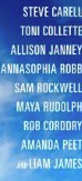
"You've put all the actors names in haven't you? That doesn't normally happen, you usually only have like one or two actors names" This is a good point and it is a convention of posters to only include a small number of actors in the credit block. However, the examples that we looked at such as the Harry Potter films included all of the actors in the credit block. Also as it is a short film and there is only a small cast we thought that we might as well just include all of them.
"The colour of the credit block suits the theme, but it could be a little bit faint it think ."
"It does fit in with the brand of the whole poster".
"I think maybe it needs to be bit more of a peach colour, because it looks bit like an off orange/brown colour. Maybe it needs to be a little bit brighter." We purposely had the credit block this colour as it matched the colour of the mask and the boarder. Although after hearing this, we believed that what was said was accurate so we have changed the colour of the credit block and listened to the criticism that was given by making it a brighter colour.
Question 4: Is there any appropriate integration of illustration and text?
"I do like the use of just the mask."
Question 5: Is there framing of shot using a variety of shot distances as appropriate?
"I think the mask is the right size."
"I don't know wether the mask needs blending into the background, maybe some shadowing underneath to give it a 3D effect" We understood what Charlotte was on about but in our defence, in photoshop the mask looks less shiny so it looks more like part of the photo.\
"Its because the mask is an actual live picture and then you look at the background and its just a block colour that's why it looks bait weird. But I think it works that way, it just draws your attention straight to the mask."
"It looks like they have based it very similarly on the film Frank's poster which also has just the mask. It is simple but its very effective."
"It sells there film in a way because their film doesn't give to much away at the beginning and their posters the same."
"You sort of wanna see the relevance of the mask like, it makes you think whys it there."
Improvements:
"Enlarge some of the texts that we have mentioned."
"I think that's it really, i think its just the texts."
"I think you need to lighten the text of the credit block a little bit"
"I think you should Photoshop the black pieces of elastic on the side of the mask, so it don't make it obvious that you've just taken a photo of a mask."
After having all of this feedback for our poster, we immediately altered all of the elements that what was identified. We lightened the credit block to a brighter colour, removed the black elastic from the mask and enlarged the text that was suggested.
Once all of the improvements was given we asked for everyone in our class to give us a level based on our first print poster. I'm proud to say that the majority of the marks given from the members in our class was either 9 or 10 out of 10 which is a level 4!
In addition to the feedback that we had from our class, we decided to expand our feedback by creating a survey using SurveyMonkey for our first print poster.
 |
| All positive feedback! |
 |
| We also received positive feedback regarding the general look of our poster. |

 |
| On this question we did receive some useful constructive criticism as we are now aware that some of the text could do with been enlarged. We will alter this element of the poster for our final print. |
 |
| We was happy to hear that the poster doesn't give to much away about the film! |
 |
| From the improvements suggested here we will change certain elements of our poster that we agree do need to be altered. However if someone has suggested something that we don't agree with we will ignore their advice. |
Suggested Marketing Campaign
Our group decided to design a marketing campaign that would suit the style of our film poster. Inspired by the variety of different posters for the Harry Potter and Deathly Hallows billboard marketing campaign, our group believed it would be a good idea to have different masks (emotions) to appear on billboards.
Here is what we had in mind:


We thought that this marketing campaign would grasp the audience's attention and interest. As the different emotions on the posters is a hint to the audience that emotions will have an influence in the film.
Film Poster- Final Print
Taking into consideration all the feedback that we received, we have adjusted our poster adequately for the greater good.
